
Olivea
E-commerceA restrained presentation with detail close by.
Discuss a similar projectOlivea


Inside the designWhat the design
What the design
brings into focus.
Olivea uses muted green, generous white space and close-up supplement imagery. The purchase panel distinguishes one-time and recurring options, while ingredients and supporting product information remain accessible below the main action.
01
Bottle and capsule imagery in a generous gallery
02
Clear recurring and one-time purchase options
03
Ingredient and supporting information grouped below
The design comparisonA closer look
A closer look
at what changed.
Original
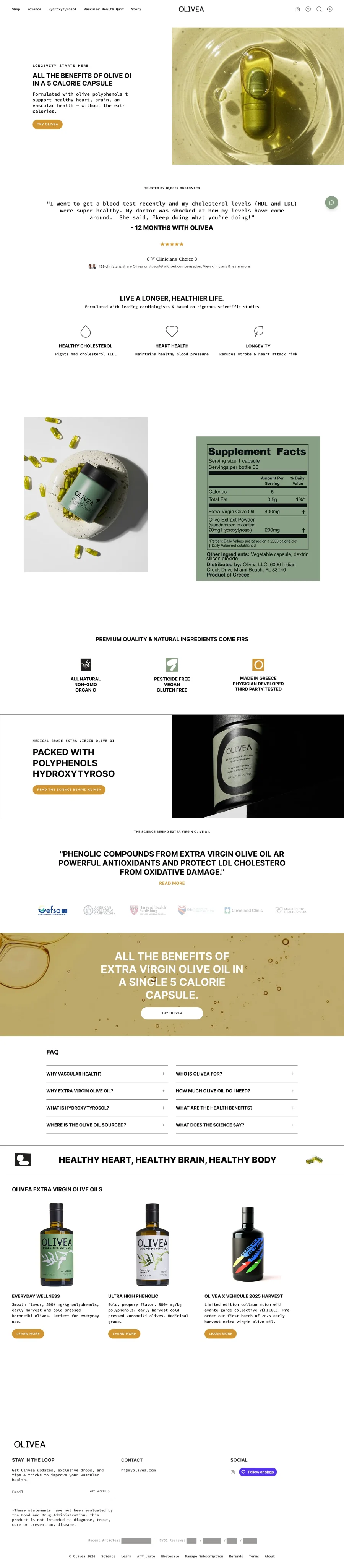
Redesign
Scroll each page to explore the details, or open a design for a larger view.
Explore the creativeThe work,
The work,
in more detail.
Open any design to explore the full page.
Project presentation
02The client perspectiveThe client’s
The client’s
perspective.
A client’s perspective on working with Convertt.
Blaine
My Olivea
Keep exploringMore work.
View all 55 projectsMore work.
More perspectives.


Your next moveYour brand.
Your brand.
Our next conversation.
A landing page, a website or a better customer journey. Let’s talk about what you need.
↳ Start with your business and your goals↳ Agree the right scope before work starts↳ One team for the work ahead
 A conversation.
A clearer next step.
Let’s start with
your business.
Tell us a little about your business and what you’d like to improve. We’ll help you find the right starting point.
Book a free strategy callA few questions to get started. No obligation.