
Phit Balance
E-commerceA bright, organised supplement experience.
Discuss a similar projectPhit Balance


Inside the designWhat the design
What the design
brings into focus.
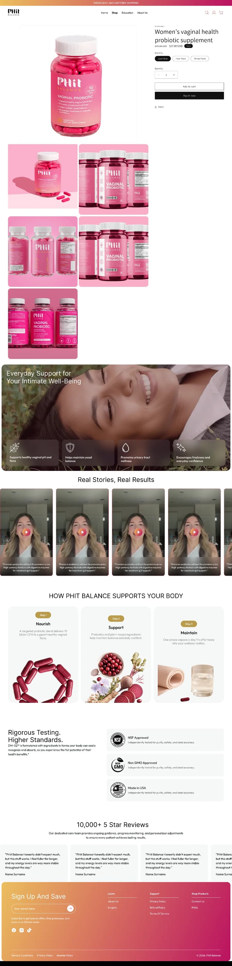
Phit Balance builds its product page around distinctive pink packaging and a compact purchase panel. Pack sizes and purchase frequency are separated into clear choices, with product detail available beneath the main action.
01
Consistent pink packaging and page accents
02
Separate pack-size and purchase-plan controls
03
Product information grouped into expandable sections
The design comparisonA closer look
A closer look
at what changed.
Original
Redesign
Scroll each page to explore the details, or open a design for a larger view.
Explore the creativeThe work,
The work,
in more detail.
Open any design to explore the full page.
Design comparison
02Project presentation
03Keep exploringMore work.
View all 55 projectsMore work.
More perspectives.


Your next moveYour brand.
Your brand.
Our next conversation.
A landing page, a website or a better customer journey. Let’s talk about what you need.
↳ Start with your business and your goals↳ Agree the right scope before work starts↳ One team for the work ahead
 A conversation.
A clearer next step.
Let’s start with
your business.
Tell us a little about your business and what you’d like to improve. We’ll help you find the right starting point.
Book a free strategy callA few questions to get started. No obligation.