What to take away
- Carry the ad’s specific promise through to the headline, offer details and destination of the primary button.
- Use proof to answer a real buying question, then check whether the complete journey works on a phone.
- Treat this checklist as a launch review; a completed checklist does not predict a conversion uplift.
1. Start with the arrival, not the page template
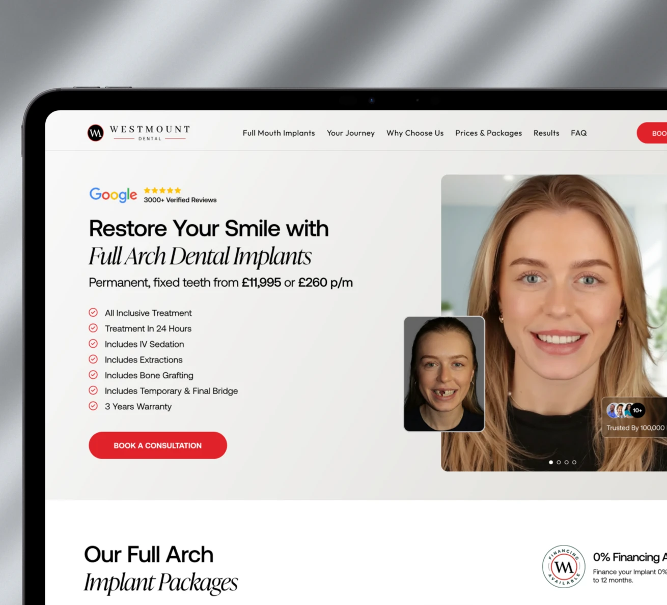
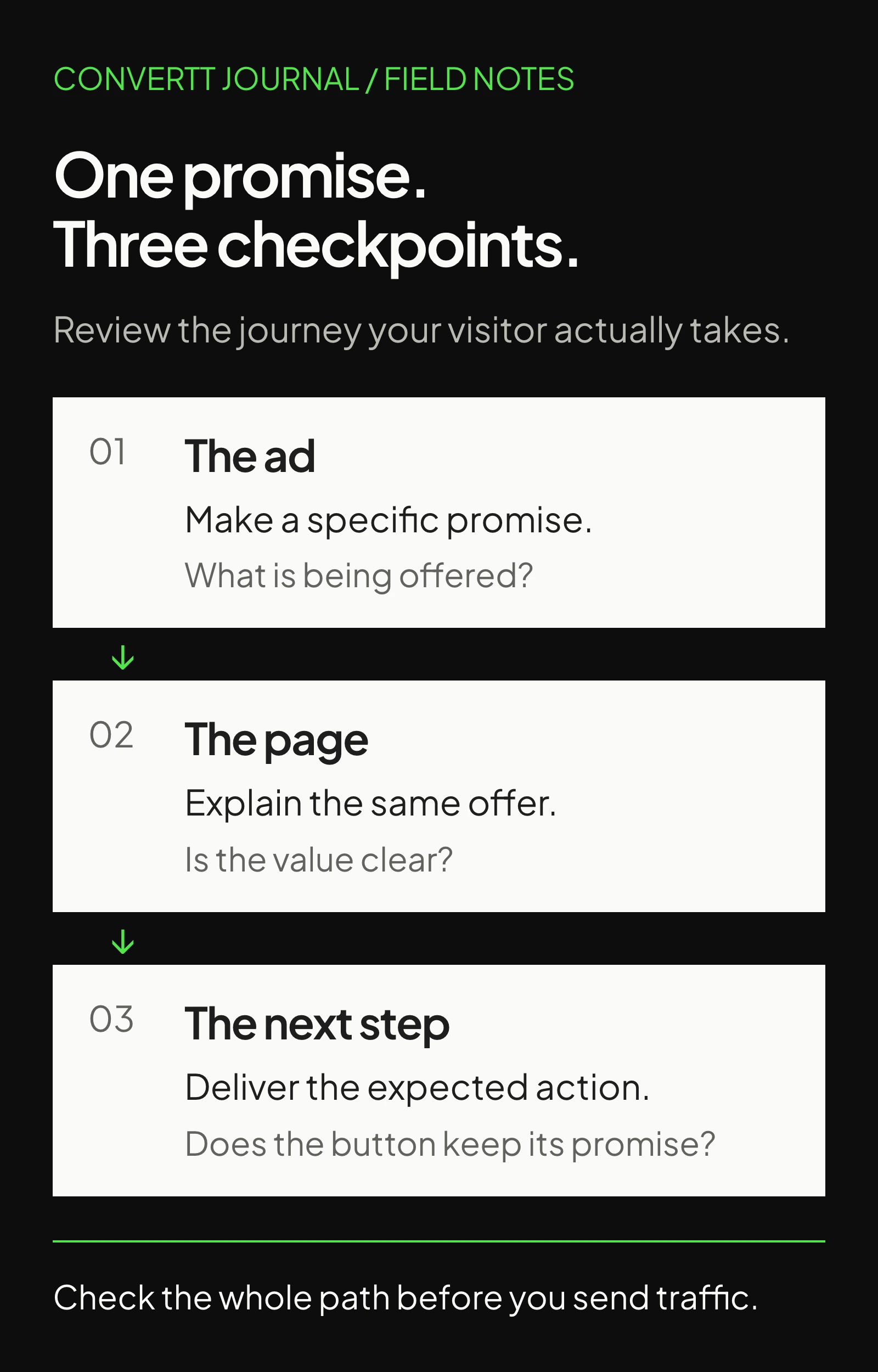
A useful landing page helps the right visitor understand an offer and take an informed next step. Before reviewing colours or section order, open the actual ad beside its destination. Write down the audience, promise, offer conditions and intended action. Review each campaign separately when those details differ.
Google Ads treats relevance, useful information and navigation as parts of landing page experience. Its guidance also asks advertisers to align their page with the ad’s action. That makes the arrival a sensible starting point, rather than borrowing a competitor’s page length or layout.
Create one review note with the live URL, campaign name, device and date. Record screenshots of problems so the designer and developer can reproduce them. Separate broken functionality from ideas that need testing; a dead booking button needs a fix, not an experiment.
2. Make the offer recognisable immediately
Read only the opening headline, supporting sentence and button. Can you identify what is offered, who it suits and what happens next? Replace a broad claim such as better growth with the actual service or product. Keep a campaign-specific price, eligibility condition or bundle easy to find.
For example, an ad offering an assessment should lead to a clearly explained assessment, not an unexplained sales enquiry. When the next step involves qualification, explain that before the visitor starts.
- Check that the advertised product, package or service is available at the destination.
- Make important conditions visible beside the offer, rather than burying them in a distant FAQ.
- Keep essential navigation to product information, contact details and relevant policies easy to find.
3. Let the first visual explain something
Choose the opening image by the question it answers. A product range can explain what is included. A service walkthrough can clarify how delivery works. A decorative office photograph may establish a setting, but it cannot explain an unfamiliar product on its own.
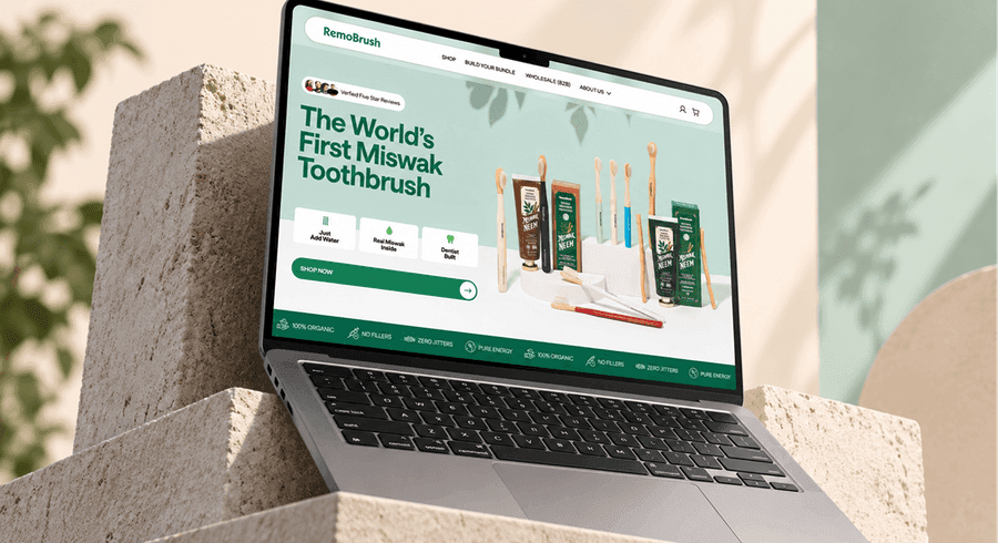
In this RemoBrush composition, the visitor can see the physical products alongside the introduction. The transferable lesson is to connect explanation and imagery. It is not a reason to reuse the same arrangement for every offer. Check the mobile crop: the product and useful context should survive it.
4. Put evidence beside the question it answers
List the questions that could delay a decision: Is this suitable for me? What do I receive? What happens after payment or enquiry? Match each question to evidence you can actually provide. Product demonstrations, clear scope, named client feedback and delivery details serve different purposes.
Check every testimonial against its source. Preserve the speaker’s identity and meaning, and distinguish direct quotes from summaries. A project screenshot demonstrates visual work; it does not establish revenue, a winning experiment or the technology behind the page. Remove claims that the available evidence cannot support.
You do not need a separate section for every objection. A short delivery note beside the purchase action may answer more than a large reassurance banner. Keep detailed explanations available when the decision needs them, especially for unfamiliar or complex offers.
5. Check the destination behind every button
Map the primary action from click to completion. Note whether it opens a form, qualification funnel, calendar or checkout. Make the label describe that immediate step. If several buttons represent the same offer, keep their destination and expectations consistent throughout the page.
Use a secondary action when it helps a different readiness level, such as reviewing relevant work before booking. Avoid adding a new funnel for every section. In a form, request information needed to route or fulfil the enquiry; explain unfamiliar fields and show recoverable errors.
6. Review mobile interaction and loading together
Use an actual phone for the complete journey. Open the menu, play a testimonial, select an option and reach the next step. Check whether sticky controls cover content or form errors. Confirm that text remains readable without zooming and that a keyboard user can reach and operate controls.
Google’s Web Vitals guidance measures loading with LCP, responsiveness with INP and visual stability with CLS. The good thresholds are at or below 2.5 seconds, 200 milliseconds and 0.1 respectively. Assess the 75th percentile of visits, separately for mobile and desktop. These describe experience, not a promised sales result.
Use available field data to understand actual visits and lab tools to investigate a specific problem. Check oversized hero media, delayed button responses and images that shift content while loading. A page can pass a lab check while still having a broken form or unclear offer.
7. Work through the launch checks
Complete these checks on the final published candidate, not only the design file. For every unchecked item, name an owner and a concrete fix. Keep unresolved hypotheses in a separate testing backlog so they do not distract from broken essentials.
Landing page launch review
0 of 8Work through your page. Your progress stays in this browser.
No account needed. Nothing is sent to Convertt.
8. Decide what deserves the next iteration
After launch, review the whole journey rather than clicks alone. For enquiries, connect completed forms to qualified opportunities where measurement permits. For commerce, examine purchases alongside cancellations, returns and support questions. Keep campaign and device context when comparing performance.
Prioritise a specific observed problem, propose a change and state what would make it useful. If traffic is limited, start with usability review and clear defects. If you run an experiment, define its primary metric and decision rule before looking at results. A polished redesign is still a hypothesis.
Sources & further reading
The references behind this guide. Examples and recommendations remain distinct from reported client results.
- Google Ads: Landing page
Defines landing page experience through relevance, usefulness, navigation and expectations created by the ad.
- Google Ads: Optimize your ads and landing pages
Supports checking offer and action alignment, useful content, mobile access and navigation. The practical review workflow is Convertt editorial guidance.
- web.dev: Web Vitals
Primary reference for LCP, INP, CLS, their good thresholds and assessment at the 75th percentile. These metrics do not establish conversion gains.
Where is your page losing the customer?
Explore how Convertt approaches the work, then look at an actual project in detail.