What to take away
- Review the product page as a sequence of decisions: understand the item, choose an available option and confirm the commitment.
- Check the actual Shopify product data and checkout behaviour; a convincing design does not prove that variants or policies work correctly.
- Use media and supporting information to answer specific buying questions, then validate improvements with customer evidence.
1. Review a real purchase, not an empty template
Choose a product with meaningful traffic and a genuine buying decision to review. Include a product with variants if your catalogue uses them. Open its storefront page, Shopify product record and checkout journey together. The task is to check that the same product, price and options survive every step.
Use recent support questions and return reasons to identify what customers misunderstand. A size question suggests a different problem from an unexpected shipping charge. Write down the uncertainty before choosing a new gallery, badge or purchase button. That keeps the review tied to evidence.
Shopify’s product details documentation covers the underlying title, description, pricing, inventory and other fields. Review those records as well as the theme. A layout change cannot repair an incorrect product weight, missing variant or outdated description by itself.
2. Make the product and price unambiguous
Near the purchase controls, explain what the customer receives: the item, quantity, dimensions or capacity, and relevant compatibility. Use familiar units and concrete descriptions. A headline about a better routine still needs enough detail to distinguish one product from another.
If you offer multiple packs, make the selected quantity and total price explicit. If a purchase renews, show the renewal commitment before the customer continues. Check that any advertised saving has a valid basis. Do not create a comparison price merely to make the offer look stronger.
Keep essential information close to the decision while placing longer specifications in clearly labelled sections. An accordion can organise detail, but it should not hide a condition that materially changes the purchase. The goal is an informed choice, not the shortest possible page.
3. Test every meaningful variant state
Shopify defines variants as combinations of options such as size and colour, with inventory managed for those combinations. Review the options your store actually sells. A visible swatch or selected label is not enough: verify the item that reaches the cart.
- Select each important option and check the displayed name, price and availability.
- Confirm that the gallery reflects the selected product when its appearance changes.
- Try an unavailable combination and check that the page explains what can be chosen instead.
- Add the item and verify the variant, quantity and price in the cart.
- Return from the cart and check whether the selection remains understandable.
For large option sets, test representative combinations and documented edge cases rather than relying on one default item. Include mobile and keyboard interaction. The most elegant selector still fails if its state is unclear or its cart payload contains the wrong product.
4. Give each image a buying question to answer
Plan the gallery around identity, scale, detail and use. For a physical product, that might mean a clear pack shot, a close-up, an image showing size and a relevant demonstration. Choose what fits the category. More images are useful only when they add information.
Shopify supports several forms of product media, including images and video. Check your theme’s presentation before adding a new format. Verify that thumbnails, zoom controls and playback work on a phone. Provide useful alternative text and avoid placing essential product details only inside an image.
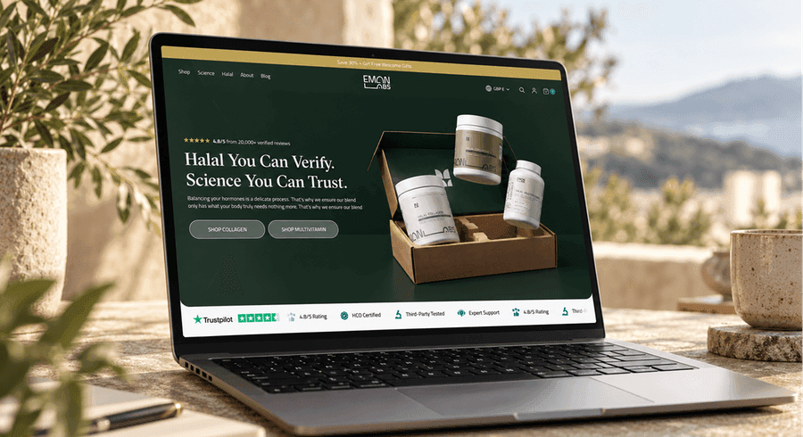
The Eman Labs artwork makes the products visible within a consistent brand setting. Carrying that visual continuity into a product page is a design consideration. The screenshot alone cannot tell you whether its claims, platform or shopping interactions have been validated.
5. Surface delivery and return information before checkout
Check what a visitor can learn about delivery cost, timing and returns before adding the product. Use the actual market and product conditions. If a delivery estimate depends on location, say so and provide a way to check it. Avoid implying one shipping promise applies everywhere.
Shopify provides store policy settings and links policies in checkout; its documentation also explains adding policy links to store navigation. Review both the policy content and where customers can find it. A footer link is useful, but a brief relevant note beside the purchase action may answer an immediate question.
Check the wording against the actual fulfilment and support process. Product exclusions, opening restrictions or return costs should not surprise the customer later. This checklist is a content and usability review, not a substitute for reviewing the policies that apply to your business.
6. Check mobile buying after apps finish loading
Review the page after reviews, chat, payment messages and recommendation apps load. Check for overlapping controls, layout movement and repeated offers. A sticky purchase bar can be helpful, but it should reflect the selected variant and leave essential content and errors visible.
Use performance data to locate the problem before removing features. Google’s Web Vitals distinguish loading, interaction responsiveness and layout stability. Review real-user data where available, then investigate slow or unstable interactions with a lab tool. A single fast desktop test cannot describe every shopper’s experience.
Ask what each app contributes to the buying decision and whether the same information appears elsewhere. Remove duplication deliberately. Do not disable a useful support or accessibility feature solely to improve a score without checking the effect on customers.
7. Complete the product page review
Run this review on a working storefront candidate. Record the product, variant, market and device so failures can be reproduced. Use your approved test-order process for checkout verification; keep internal checks out of business reporting.
Product page purchase checks
0 of 8Work through your page. Your progress stays in this browser.
No account needed. Nothing is sent to Convertt.
8. Measure the purchase journey, not one button
Fix incorrect data and broken purchasing states first. Then prioritise questions supported by customer feedback and observed behaviour. A rise in add-to-cart events is incomplete evidence if completed purchases fall or returns increase. Review the relevant downstream outcomes before declaring a change successful.
Separate traffic changes, promotions and stock availability from page changes when interpreting results. If you run a controlled experiment, define the metric and decision rule in advance. The checklist helps identify worthwhile work; it cannot determine which redesign will win or guarantee a revenue outcome.
Sources & further reading
The references behind this guide. Examples and recommendations remain distinct from reported client results.
- Shopify: Product details page
Documents product information fields. The purchase-review sequence and prioritisation are Convertt editorial recommendations.
- Shopify: Variants
Explains option combinations and variant inventory; supports checking the actual variant behind the interface.
- Shopify: Product media
Documents supported media forms and product presentation. It does not establish that the Eman Labs artwork uses Shopify.
- Shopify: Adding store policies
Explains store policy settings and policy links. Policy requirements depend on the business and relevant market.
- web.dev: Web Vitals
Distinguishes loading, responsiveness and visual stability. Performance metrics are not a guarantee of commercial outcomes.
What is stopping the next purchase?
Explore how Convertt approaches the work, then look at an actual project in detail.